Showing posts with label Dashboard. Show all posts

Thursday, July 31, 2014

Weird Al FTW

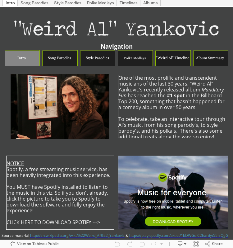
My enthusiasm for "Weird Al" started back in 1996 when I was at a friends house and he played the "Bad Hair Day" album for me.  I didn't know any of the regular songs, but I thought everything he did was super funny and also made me dance around the house.  As time went on, I was able to see him live twice (a must do for anyone) and somehow at every stage of life, I've found other people who enjoy listening to Al as well.  

To celebrate his latest album, "Mandatory Fun" and it's climb to #1 on the Billboard charts, I have created  a viz to show off how much Al has accomplished and give the user a way to interact with his music like never before.  

Hope you enjoy!


Tuesday, January 14, 2014

Defense vs Offense: A Chicago Bears Coaching Transition

In January 2013, the +Chicago Bears  made the largest coaching philosophy transition when they fired Lovie Smith after a 10-6 season and hired Marc Trestman from the CFL.  

How did their back-to-back seasons compare? Check out the viz below for more information.

UPDATE: As pointed out by my brother +Matt Montgomery , there are two other reasons to be excited for the +Chicago Bears that I will try to incorporate into the viz.
1. Top Offenses > Top Defenses via AdvancedNFLStats
2. Offense is more consistent than Defense, year to year via FootballOutsiders

Monday, December 16, 2013

A Single Pixel (Or Hide) Can Save Your Tableau Viz

UPDATE: After posting this in the Tableau Tips and Tricks community, +Shawn Wallwork pointed out an alternative to my solution that is built right into Tableau.  It was a lesson for me, so I wanted to share it here as well.

While working on my Mike Ditka dashboard (here and on Tableau Public), I had an interesting idea for 'Da Coach' viz: While showing a timeline of a particular coaches season records over time, I would also indicate if the coach had won a Super Bowl that year.

I had found a great site that had images of the Super Bowl logos and used a Chrome extension to download all of the them.  After making a shapes folder for the Super Bowl images in my Tableau Repository, I mapping the images to the coach-season combination that was appropriate.  This layered on top of a line chart started to become....

Ugh...so close, yet so far away
not what I was hoping for.  There were far more 'Null' values than images to display, and if I made the sizing smaller, the Super Bowl logos would not show up.

NEW METHOD: Tableau builds in a way to accomplish hiding the unwanted shapes.  

First, select (left click) the shape you want to hide.  This is CRITICAL because jumping this step will not get you the menu options you want.

Second, right click on the object you want to hide and check 'Hide'
REMEMBER: You will only see this option if you select the object to hide first!

If you ever need to see the data that you have hidden, you can select the drop down of the shape card, and select 'Show Hidden Data'

This accomplishes the same task as the original method, while also providing some additional space in the Viz.  But be sure to remember what you've hidden so you don't loose track of your data. 

ORIGINAL METHOD: Epiphany: what if I made the image for 'Null' values a single pixel?  That way, it will be so small it won't be seen as an image, and even if I need to make it bigger, it still will not be noticed.  
Sure enough, a website hosts an image of a transparent single pixel.  After downloading the image and saving it to my shapes folder, it was easy enough to assign: just hovering over they general area Tableau gave me a easy-to-select box.
Selecting a transparent single pixel inside of Tableau
Worksheet updated!

In the end this gave me the worksheet I was hoping for all along.  Maybe this will help you too in your next viz!  Take care.

Friday, December 6, 2013

How Does Your Favorite NFL Team Spend Its Salary Cap, Part 2

With the original salary cap posts, fans could look at how their favorite team spent its salary cap across different positions.  In Part 2, fans can see how the spend of their team compares to other teams for specific positions.  For instance, the Atlanta Falcons are spending more money on 1 quarterback (Matt Ryan) than the Minnesota Vikings are spending on 3 quarterbacks (Matt Cassel, Christian Ponder, and Josh Freeman), though both are 3 win teams.

The original spend dashboard is also included on a separate tab if you want to go back and check the original data.

Enjoy!


Wednesday, November 20, 2013

Dreamforce Conference Visualized

Dreamforce is a the new product announcement from Salesforce and is being announced as of this moment in San Francisco.  To help understand what is being tweeted out at the conference, I have visualized some of the data being tweeted out (with the help of Nelson Davis on data gathering) and organized it so you can see the different types of languages people are tweeting in about Dreamforce.

Enjoy.


Saturday, November 16, 2013

Football Outsiders DVOA Visualized

Football Outsiders DVOA Visualized

UPDATE: The visualization has been updated for Week 16.

Football Outsiders is a website dedicated to statistically understanding how different football teams perform when adjusted for the strength of their opponents.  The specifics of DVOA can be found on their site, but in general, the stat shows how a team will perform on each down and whether they will be able to move the ball progressively down the field (or stop the ball on defense).  A positive DVOA is better than a negative DVOA, except on defense where a negative DVOA is better than positive.  

However, a team's performance is not always reflected in their record.  A team (Team A) with few losses may have that record because they are winning close games and playing weak opponents.  On the other hand, a different team (Team B) that has a worse record may have faced tougher opponents but lost close games, but are winning big when they do win.  In this case Team B would probably have a better DVOA than Team A, and would be more likely to beat Team A in a game.

I have taken that data that Football Outsiders has prepared and visualized it in Tableau Public, which allows users to interact with the data to find out more information about their team.  Feel free to select your favorite team and learn more about their performance.