Showing posts with label Visualizations. Show all posts

Wednesday, March 19, 2014

Ready, Set, #IronViz

March is Sports Blogging Month at +Tableau Software.  If you have ever visited my blog before, you know that's definitely the kind of blogging I can get behind (all but 2 of my vizzes have related to sports).

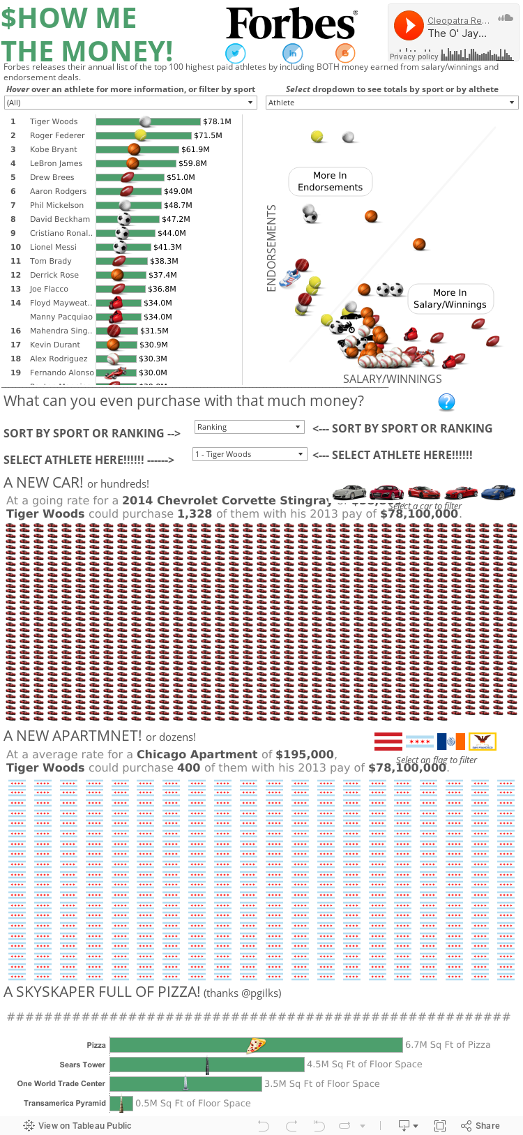
So here is my official submission for the sports blogging month and #IronViz sports blogging challenge.  Forbes publishes a list of the top 100 earning athletes and in addition to finding insight into HOW these athletes earn their money (endorsements vs salary/winnings), I tried to put a picture around what exactly $78 million dollars translates to (answer: a lot!). 

So enjoy and feel free to comment or let me know if you have any questions.  Thanks!


Thursday, February 27, 2014

#VizYourLife: Moving to San Francisco

Not that anyone's holding their breath, but it's been over a month since I posted any content on my blog.  In that time, I did the following

  • Said goodbye to the city I've lived in for 28 years (minus college)
  • Packed up almost of my belongings that would fit into my car.
  • Drove across the country to San Francisco
  • Started working the day after I've arrived
  • Slept or looked for an apartment nearly every minute I haven't been working
So needless to say I have been very busy, or just exhausted enough that I've put the blog on the back burner. 

However, here are some viz's based on my last month.

This is my 3 (really 4) day drive from Chicago to the Bay, stopping Nebraska, Utah, and Sacramento
California is currently experiencing a crazy drought, though it was down pouring when I got into Tahoe
Chicago has more negative equity...
...and SF is just insanely expensive.

Chicago real estate is in higher foreclosure, California real estate is just insanely expensive.

And while Chicagoans are very proud of their food, San Francisco is not as hippie-dippie vegan/vegetarian as people seem to think they are.

Pizza, hot dogs, chili...yeah that sounds right
A burger right off the bat, follow by a Cioppino, which looks like an awesome seafood dish.

In short, sorry for the delays.  I'm still getting settled but I'm so glad to be out in the Bay and looking forward to blogging and meeting up with Tableau users.  

Take care, everyone.

Links:

Wednesday, January 22, 2014

New To Data Blogging: 3 Lessons 3 Months In

When +Ben Jones announced Data Blogging Month, I thought about if I should write anything on the subject or not.  I've only started blogging about 3 months ago, so I'm still very new to this space.  Plus, after learning more about the Tableau Public community, I'm continually humbled by what I see the community put out and feel like I always have things I can be learning.

But this may also be an opportunity to turn an apparent weakness into a strength: I have the perspective of someone new to the game who is trying to establish a voice and presence while encountering some early bumps in the road.  I've probably learned more in the past 3 months than I had in my previous 3 years of using Tableau (kicked off with a schooling by Nelson Davis), and maybe these are the same things that others are going through in their early experience of getting into +Tableau Software Blogging.


1. The Story Being Told Is Paramount

This may seem like the most fundamental concept of data visualization, but is also the very thing that is easiest to lose sight of.  In the midst of getting your worksheet perfect and leveraging Tableau's capabilities (not to mention thinking about getting views/retweets/reposts), it becomes very easy to resort to "this will look cool" or "look at how smart I am" types of worksheets that ultimately end up confusing the user and turning people away from the viz...  

...and the tool won't get in your way from doing it.  Tableau is so developer friendly, there is no disincentive to complicate.  I can't count the number of times I've been building and thought along the lines of "It'll look better when I color the line with this metric, or size it with another metrics, or throw in a table calc".  Only later, when showing it to someone and they can't understand what in the hell is going on, does this come back to bite you.

The story you are telling grounds you.  Even when you are absolutely lost, are suffering writers block, or aren't feeling creative, the story you are telling is what re-engages and brings you back to focus.  An engaging story, even if it doesn't have as many bells and whistles, is will keep users looking and sharing.  Don't be a Sheldon and push people away with how smart you think you are.

2. Great Design Takes Time (And Lots Of Iteration)

A goal in the next month is to film how long it takes me to make a dashboard that I publish on Tableau Public.  The idea being that even with the ability to create insight in 3 minutes, I would guess that I spend about 15-30 HOURS of development, and countless more hours even thinking about it, before I get to a Viz that I post up.  The dashboards that win Viz of the Day probably go through the later process more so than the former process.

I may be on the slower end (it's not really something I've polled other developers about), but all of that time is spent in a number of different ways
  • I probably create 8-12 worksheets to investigate my data before getting to the 3-4 worksheets in my final viz
  • I'll wish I had more data to answer a question, so then I need to research and find that additional data and bring it into my workbook
  • I'll play with the layout of my dashboard in numerous different combinations
  • I add too much content and now I need to pear it down
  • If there's text, I'm constantly rewording to hit the message while taking up as little space as I can 
  • I'll mess with different color pallets to see if there are better color combinations (FYI: Cyclic is the bomb!)
  • I share drafts with peers and iterate based on their notes 
It may be inefficient, but I reassure myself with a quote from the #TCC13 keynote: "The great discoverers are jazz artists— they combine logic with intuition." Discoverers feel, they chase, they shift perspectives and they relate different ideas."  My overall time may be longer than others, but I would put money that the great final products didn't come together exactly as you see them.  Rather, they were the result of exploration, revision, and polish.

3. Your Blog Is About You, Not Your Audience

The beautiful thing about the internet is the ability to instantly share your thoughts and receive feedback with a global audience in near real time.  I can publish a post, tweet it, and start hearing from others in less than 10 minutes.  That tight feedback loop can dig into our own image of ourself.  Early on, I fell into the trap of being crushed when I didn't instantly have thousands of retweets or get a million comments.  Even after winning Viz of the Day with my Mike Ditka Viz, life moved on and the next day there was a new Viz of the Day (won by my very talented colleague +Peter Gilks none the less).

Now, I'm not saying that being recognized isn't a big deal.  Winning Viz of the Day was a huge honor; something I'm still very proud of and grateful for.  I'll never forget jumping up and down when someone who I didn't know (ended up being +Steph Stradley) retweeted one of my first posts.  But getting lost in the idea that "everything I do has to win/be retweeted/get views" became more important than "design something that efficiently tells a story and relays my passion for a topic".

Refocusing my efforts back to the process of telling stories that I'm passionate about, and less about the results of those efforts has made the experience enjoyable again.  I still reach out for feedback from my talented colleagues at +Slalom Consulting and I look at what the +Tableau Software community, especially the Tableau Zen Masters, are producing (my current favorite being +Kelly Martin and her VizCandy blog) to continue to refine my skills.  But at the end of the day, my blog is mine; something I do to share my interests in a way that maximizes/sharpens not only my Tableau skills, but also my design skills.

Conclusion

Maybe I'm wrong.  Maybe I'm the only guy who gets lost in rabbit holes of features instead of story.  Maybe I'm the only one who takes forever to get my viz's together.  Maybe I'm the only self deprecating narcissist on the internet.  Either way, these all were lessons that I had to learn (and continue to relearn) to be confident and okay with putting myself and my passions out for the world to look at (or ignore).  I've improved my Tableau skills beyond where they were before I started and I'm looking forward to what the Tableau Public community (myself included) can produce in the time to come.  Thank you.

Tuesday, January 14, 2014

Defense vs Offense: A Chicago Bears Coaching Transition

In January 2013, the +Chicago Bears  made the largest coaching philosophy transition when they fired Lovie Smith after a 10-6 season and hired Marc Trestman from the CFL.  

How did their back-to-back seasons compare? Check out the viz below for more information.

UPDATE: As pointed out by my brother +Matt Montgomery , there are two other reasons to be excited for the +Chicago Bears that I will try to incorporate into the viz.
1. Top Offenses > Top Defenses via AdvancedNFLStats
2. Offense is more consistent than Defense, year to year via FootballOutsiders

Monday, December 23, 2013

Tableau #3minwin

I created an entry for the Tableau #3minwin competition.  I built this dashboard in under 3 minutes using NFL weather data (and some data from Pro-Football-Reference) and I've included the youtube video to prove it.  Enjoy!


Wednesday, December 18, 2013

Nuclear Power's Effect On Carbon Dioxide Emissions

Some may know this, but my undergrad was actually in Nuclear Engineering.  While I do not necessarily practice it day to day (as I'm sure most people say of their undergrad education), I certainly walked away with a real passion for the benefits of nuclear energy.  It has the ability to generate electricity on the hundred megawatt or even gigawatt level (on par or better than existing fossil fuel plants), produces no carbon dioxide, and properly maintained plants produce no additional radiation to the surrounding area, among many other benefits.

Inspired by +Hans Rosling (the +Tableau Software TCC14 keynote speaker) and the work at Gapminder, I built a dashboard that tells the story of how countries that embrace nuclear energy (especially France) have seen a reduction in their carbon dioxide emissions, while countries that have little or no nuclear presence are seeing large increases in their carbon dioxide emissions.  

If you would like to learn more about nuclear power, there was also a documentary that was shown on CNN called Pandora's Promise, which interviews well known environmentalists that now support nuclear energy and investigates nuclear power from a variety of different angles.

Enjoy and feel free to comment below.


Monday, December 16, 2013

A Single Pixel (Or Hide) Can Save Your Tableau Viz

UPDATE: After posting this in the Tableau Tips and Tricks community, +Shawn Wallwork pointed out an alternative to my solution that is built right into Tableau.  It was a lesson for me, so I wanted to share it here as well.

While working on my Mike Ditka dashboard (here and on Tableau Public), I had an interesting idea for 'Da Coach' viz: While showing a timeline of a particular coaches season records over time, I would also indicate if the coach had won a Super Bowl that year.

I had found a great site that had images of the Super Bowl logos and used a Chrome extension to download all of the them.  After making a shapes folder for the Super Bowl images in my Tableau Repository, I mapping the images to the coach-season combination that was appropriate.  This layered on top of a line chart started to become....

Ugh...so close, yet so far away
not what I was hoping for.  There were far more 'Null' values than images to display, and if I made the sizing smaller, the Super Bowl logos would not show up.

NEW METHOD: Tableau builds in a way to accomplish hiding the unwanted shapes.  

First, select (left click) the shape you want to hide.  This is CRITICAL because jumping this step will not get you the menu options you want.

Second, right click on the object you want to hide and check 'Hide'
REMEMBER: You will only see this option if you select the object to hide first!

If you ever need to see the data that you have hidden, you can select the drop down of the shape card, and select 'Show Hidden Data'

This accomplishes the same task as the original method, while also providing some additional space in the Viz.  But be sure to remember what you've hidden so you don't loose track of your data. 

ORIGINAL METHOD: Epiphany: what if I made the image for 'Null' values a single pixel?  That way, it will be so small it won't be seen as an image, and even if I need to make it bigger, it still will not be noticed.  
Sure enough, a website hosts an image of a transparent single pixel.  After downloading the image and saving it to my shapes folder, it was easy enough to assign: just hovering over they general area Tableau gave me a easy-to-select box.
Selecting a transparent single pixel inside of Tableau
Worksheet updated!

In the end this gave me the worksheet I was hoping for all along.  Maybe this will help you too in your next viz!  Take care.

Thursday, December 12, 2013

How Does Your Favorite NFL Team Spend Its Salary Cap?

NFL Teams are allotted a certain amount of money every year to spend on its players; that money is referred to as the salary cap.  A teams spends its salary cap on players base salaries, various bonuses, severed contracts, practice squad players, and penalties to the team.  Each team has to weigh the existing contracts with valued positions and potential contract extensions before hiring and releasing players.  

Use the visualization below to better understand how your favorite NFL spends its salary cap.  You can select a team, a position, or a player to learn more about the respective team expenses.  

Enjoy and feel free to comment below.


Tuesday, December 10, 2013

Viz of the Day!

Today I was very honored to find out I had won Tableau Public's Viz of the Day, a daily selection of cool dashboards built and hosted on Tableau Public. I am very excited to get the Mike Ditka dashboard up and in front of people, showing the impact of a Chicago Bears legend.

I even got to go to the game last night to watch his number get retired at the game with my dad!  It was bitterly cold, but a fantastic 45-28 win over the Cowboys.

My Dad and I at the Bears-Cowboys game, 12/9/2013. Ditka's number was retired at halftime.


Thank you everyone who liked and shared the viz.  It has been a crazy couple of days, but very exciting.  Take care.

Friday, December 6, 2013

How Does Your Favorite NFL Team Spend Its Salary Cap, Part 2

With the original salary cap posts, fans could look at how their favorite team spent its salary cap across different positions.  In Part 2, fans can see how the spend of their team compares to other teams for specific positions.  For instance, the Atlanta Falcons are spending more money on 1 quarterback (Matt Ryan) than the Minnesota Vikings are spending on 3 quarterbacks (Matt Cassel, Christian Ponder, and Josh Freeman), though both are 3 win teams.

The original spend dashboard is also included on a separate tab if you want to go back and check the original data.

Enjoy!


Saturday, November 16, 2013

Football Outsiders DVOA Visualized

Football Outsiders DVOA Visualized

UPDATE: The visualization has been updated for Week 16.

Football Outsiders is a website dedicated to statistically understanding how different football teams perform when adjusted for the strength of their opponents.  The specifics of DVOA can be found on their site, but in general, the stat shows how a team will perform on each down and whether they will be able to move the ball progressively down the field (or stop the ball on defense).  A positive DVOA is better than a negative DVOA, except on defense where a negative DVOA is better than positive.  

However, a team's performance is not always reflected in their record.  A team (Team A) with few losses may have that record because they are winning close games and playing weak opponents.  On the other hand, a different team (Team B) that has a worse record may have faced tougher opponents but lost close games, but are winning big when they do win.  In this case Team B would probably have a better DVOA than Team A, and would be more likely to beat Team A in a game.

I have taken that data that Football Outsiders has prepared and visualized it in Tableau Public, which allows users to interact with the data to find out more information about their team.  Feel free to select your favorite team and learn more about their performance.