Sunday, September 28, 2014

How to auto-scale and auto-arrange shapes/visuals in Tableau

I ran into a unique problem when I built my sports viz a while back.  I had this idea to show a picture for every value of a metric.  However, when I sized the sheet to fit the maximum allowable values, any less than the maximum showed a large amount of white space. (I've since updated the sports viz with this article's trick)  

Then my friend Steven Carter released his viz titled "The Adoption Gap" (and subsequently won Viz of the Day) where he took my picture idea to the next level with his household grid.  Using formulas, he was able to set a grid, and then show a gradually filled in house to represent the number of adoptions needed.

AND THEN Chris Luv released his viz explaining INDEX() and SIZE(), two incredibly valuable table calculations in tableau to determine size and position of a point.  Using INDEX and SIZE, he was able to completely recalculate row and column values on the fly, removing a lot of constraints Steven and I had come up with. His final viz was so good, it made me rethink my entire design.

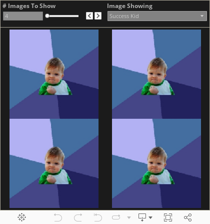
Having been inspired by a number of sources, I present a fourth option (very close to Chris' solution but with a slight tweak). I have build a sample viz that shows how to use formulas and table calculations to autoscale and autoalign shapes (or visualizations as Chris will show) to a grid based on how many values are available. Check out the final result below.


HOW TO

In my original sports viz, I was unaware that Tableau will do the sizing and arranging work for you if you have rows and columns that the images will fit in.  So here's how to use a unique ID column to auto generate the links we need

1) Create 'Y Axis' Field

INT((INDEX()-1)/ ROUND(SQRT(SIZE())))

So what is going on here?  The idea is that as the number of objects to display is usually best represented in equal rows and columns.  Thus, the number of rows we want (represented on the Y axis) should be the square root of the objects/dimension values.  The INDEX() -1 offsets the values so they continue to line up instead of shifting out.

2)  Create 'X Axis' Field

INDEX() - (INT((INDEX()-1)/ROUND(SQRT(SIZE())))) * ROUND(SQRT(SIZE()))

This one is a bit more complicated, but is to continue to hit on the idea of displaying equal number of rows and columns.  So with the 'Y Axis' figuring out a bucket for values for the row, the X axis needs to reassign the ID for the value so that the rows start over successfully.

So what this formula is doing is taking the current index value, subtracting the y axis bucket multiplied by the bucket value to always reestablish the new set of rows.

3) Build sheet and assign shapes

The setup is as follows
a) [ID] goes in the details
b) 'X Axis' goes on the columns shelf, convert to discrete
c) 'Y Axis' goes on the rows shelf, convert to discrete
d) 'Y Axis' and 'X Axis' should be addressing every field (see second screenshot for the how to)
a), b), & c)
d)
Let me know if this is helpful or if you have any questions.  Thank you!

Wednesday, September 10, 2014

How to Embed Streaming Web Content in Tableau

Tableau is a great, if not the best, tool for building data visualizations.  But what the tool also includes is the ability to display content from the internet right in your viz!  Here is the how to for streaming that content, and I will be using my "Weird Al" viz as the template for this.

1. Build the Data Set

If you want an interactive viz that dynamically displays different web content, you first need to build a data set that shows the different components you want to stream.  In the case of "Weird Al", I wanted to stream his individual songs and albums, so I went to Wikipedia for his discography and copied it into a spreadsheet. 

  • Just like any other Viz, a content viz is still data driven, so be sure you have the most robust/cleanest data you can work with
Album data with various attributes
Song data with various attributes

2. Gather the web links

In a "How-To" guide that allowed me to even build out this idea, +Ben Jones wrote about embedding YouTube into Tableau.  The key is that regardless of your content source (YouTube, Spotify, Soundcloud, etc), you want to find the 'embed' url to leverage in your dashboard.  In Spotify, these can be found by right clicking on a song and selecting 'Copy Embed Code'
The resulting code will look something like this, and the URL that you want is highlighted in yellow: <iframe src="https://embed.spotify.com/?uri=spotify:track:4ZJGobiy4ayWSdKfoqMRlX" width="300" height="380" frameborder="0" allowtransparency="true"></iframe>

That URL can be copied to your Excel data like so
It is very important to line up the correct URL to the correct record in the data

  • Regardless of web source (YouTube, Spotify, Soundcloud, etc), identify the Embed url the desired content, and include that in your data source

3. Build a Dashboard That Will Stream the Web Content

In your viz, design your dashboard however you wish.  For the "Weird Al" viz, I wanted people to be able to select an image of the original artist and then be able to play that song.  Here is what the resulting Tableau sheet looks like
The field containing the URL needs to be in the details of the worksheet
In the dashboard, add the worksheet as well as a Web Page item.

After adding Web Page, select 'OK' to continue.  It's okay to leave it blank
With the URL is part of the details, the URL can be triggered from the dashboard via an action.
Add the sheet to a dashboard, then select Dashboard -> Action
The type of Action to add is a URL action
Check off the sheets you want the action to work from, and then select the field that contains the URL you wish to stream.
Select the arrow, then select the field that has the URL
After that, you can now stream by making a selection on the specified sheets (in this case Parody Song - Images and Parody Song - Lists) and the url listed in the data will appear in the web part.

  • After placing a Web Page part on your dashboard, you can use a URL Dashboard Action to pull the streaming content from the selected data point.

BONUS POINT. Custom Hyperlink Text

In the section above, the url action was delivered using a 'Select' URL action.  That means when a component of the specific worksheet is clicked on then the action will take place.

Tableau also offered 'Menu' actions, meaning that when you hover a specific data point, a URL link appears in the tooltip for you to select.  The advantage here is that you can variablize the text in the tool tip.  For example, the links could looks something like this...

This is easy enough to do.  Start with the URL action just like before

Select the 'Menu' action, and whatever you put in the Name will be what's displayed to the user.  You can even variablize the name by including values from the data, in this case Song title.


  • Actions can be selection or text based.  The text based actions, however, can be customized to display a message to the user relevant to the data point they are hovering on.

Conclusion: Steaming Web Content is Easy and Awesome in Tableau!
So there you have it, a breakdown of the how to embed steaming web content in your Tableau dashboard.  Check out the original viz for the interactive experience.


Making a Viz That Stops Traffic

I was honored to be asked to speak at +Tableau Software's Customer Conference this year with the extremely talented +Anya A'Hearn and +Paul Banoub at a feature presentation entitled "Making a Viz That Stops Traffic" hosted by the ever amazing +Jewel Loree.  I gave the following presentation, which compiles my thoughts and process for how I approach building dashboards and visualizations.

Enjoy and feel free to comment to let me know your thoughts.  Thank you.